The SRE golden signals are latency, traffic, errors, and saturation: response time, demand, failed outcomes, and how close the service is to its working limits. SRE monitoring collects information about how a service is behaving so that people can notice and investigate problems, and these four signals are the measurements to start with for almost any service.
For TicketDesk, the fictional booking app, begin with whether people receive the correct tickets. Measurements of computers and software help explain why that experience might be failing, but they are evidence, not the goal. If you can keep that order straight, the rest of this lesson will feel natural.
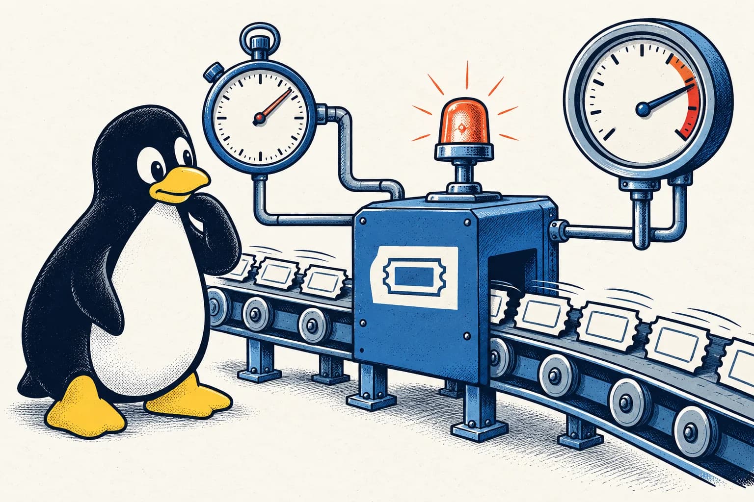
- 01Response time and failures
- 02Demand and limits
- 03Records of what happened
What do the four golden signals mean?
The four golden signals describe how long the service takes, how much work arrives, how often it fails, and how close it is to its limits.
Latency is how long an operation takes. If a customer presses Book and waits two seconds for an answer, that response has two seconds of latency. Measure successful and failed attempts separately when useful. An immediate error can be faster than a successful booking, so a lower response time does not always mean things improved.
Traffic is the amount of demand arriving. TicketDesk could count booking attempts per second. Choose a unit that describes the work the service must perform.
Errors are failed outcomes. These can include software failures, answers that arrive too late, or an incorrect result that the software labels as successful. You need a way to detect incorrect results before they can appear in an error count at all.
Saturation describes how close a resource is to its useful limit. A computer's processor is one resource. The software may instead be limited by how many tasks it can handle at once or how much work is waiting. A queue is a list of tasks waiting to be done; a growing queue can signal that the service is falling behind.
These measurements help you locate trouble. TicketDesk also needs to check delayed confirmations and correct booking records, because a problem can happen after the initial checkout response.
What are metrics, logs, and traces?
Metrics, logs, and traces are the three main kinds of evidence a service produces, and each answers a different question. A metric is a numerical measurement, such as failed bookings per minute. Repeated measurements make trends visible. A log records an event, such as a confirmation attempt ending with an error. A trace follows one request through the steps performed by different parts of the software, showing where time was spent.
Imagine failures rise on a chart. Logs show repeated missed confirmation deadlines. Traces show a long wait before confirmation work starts. Together, these narrow the investigation to that waiting period.
They do not yet explain the cause. Another service TicketDesk relies on, called a dependency, might have slowed down. Or TicketDesk might be sending it more work per booking. Observability is the ability to understand the service's internal behaviour from the evidence it produces. Useful evidence helps you distinguish those possibilities instead of guessing.
Can a good overall result hide a serious problem?
Yes. A healthy overall percentage can hide a group of customers who are failing badly, because the larger successful group outweighs them. Suppose TicketDesk serves customers from two geographical areas, called regions. In ten minutes, Region A handles 98,000 attempts with 98 failures. Region B handles 2,000 attempts with 400 failures.
Global error rate = (98 + 400) / 100,000 = 0.498%
Region A error rate = 98 / 98,000 = 0.1%
Region B error rate = 400 / 2,000 = 20%
The overall success rate is just over 99.5%. Region B's customers experience one failure in five attempts. The larger successful group makes that problem almost invisible in the total.
Break measurements into meaningful groups, such as region, booking type, or software version. Show the number of attempts alongside each percentage: one failure in five attempts provides less evidence than thousands of attempts at the same rate.
Why not collect every possible detail as a metric?
Collecting every detail as a metric makes the monitoring system expensive and hard to use, because each distinct value creates another series to store and query. A metric label separates measurements into groups, such as Region A and Region B. Every different combination of labels creates another sequence of values. Putting a unique booking identifier in a label can create a new group for every booking, increasing cost and making the monitoring system slower and harder to use.
Engineers call the number of distinct label combinations cardinality. Keep metric groupings manageable. Identifiers that help investigate individual requests often fit better in controlled logs or traces.
Diagnostic records should exclude passwords, payment details, and customer secrets. Knowing which step failed usually does not require copying sensitive information into a broadly accessible record.
What should a dashboard show first?
A dashboard should show the customer's most important task first, with resource details further down. A dashboard is a page of measurements and charts. Put correct booking completion, response time, and confirmation delay near the top. Demand and recent app changes provide context. More detailed resource measurements can help explain the symptoms.
Someone investigating should be able to see who is affected, when the problem began, and whether it is getting worse. Those questions also guide on-call troubleshooting. A page of healthy computer checks does not answer them if customers cannot buy tickets.
How do you know the service is recovering?
You know the service is recovering when customers complete their bookings again under normal demand, not merely when a failure count drops. Check demand alongside failures. A lower failure count could mean fewer people are trying, or that attempts are failing before they reach the place being measured.
Follow accepted bookings through to confirmation too. The first response may look healthy while the software doing later confirmation work falls behind. Check the affected region under normal demand, rather than relying only on a better overall percentage. Use this evidence when deciding which conditions need an urgent alert.
Exercise: faster responses, worse bookings
During a failure, p50 latency falls from 200 milliseconds to 80 milliseconds, while errors rise from 0.1% to 10%. Here p50 means the middle measured response time: roughly half the requests finish at or below it.
What might explain this? Quick error responses are one possibility. Slow requests disappearing before the measurement point are another. Test your reasoning by separating successful and failed response times, checking demand, and examining affected groups.
In an interview, explain the purpose of each measurement before naming a tool. Tools change; the questions you are trying to answer do not.
Quick answers
What are the four golden signals of monitoring?
Latency (how long operations take), traffic (how much demand arrives), errors (how often outcomes fail), and saturation (how close resources are to their limits).
What is the difference between monitoring and observability?
Monitoring is collecting and watching measurements you decided on in advance. Observability is how well the service's evidence, including metrics, logs, and traces, lets you understand its internal behaviour when something unexpected happens.
What is high cardinality in metrics?
High cardinality means a metric has a very large number of distinct label combinations, for example one per booking. It drives up storage and query cost, so unique identifiers belong in logs or traces instead.